
This is a story about data collection...
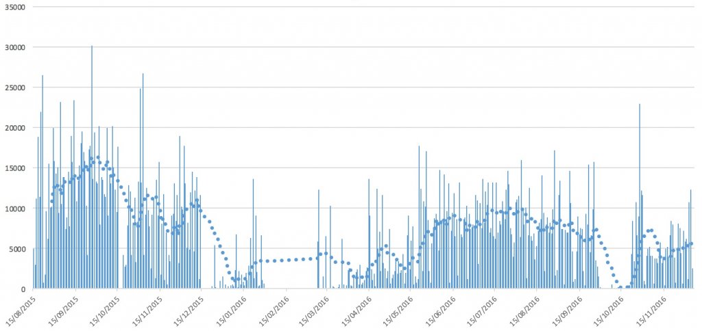
Here's a graph of my daily step count for the last 18 months, as recorded by my iPhone. I practically always have my iPhone in my pocket, so it should be fairly accurate.
As you can see, there are big gaps.
I've added a 14-day moving average to the graph too, which is the dotted line.
How do I interpret this?
The optimistic interpretation is that I was overdoing it last year and had a big crash. There's a little gap in the graph that you can hardly see at the end of October. I was in hospital then. This year got off to a shit start and then improved and stabilised, but I still had a hiccup at the start of October. The graph is much flatter on the right hand side - on average - than it is on the left hand side. Perhaps the volatility in my life has been reduced.
The pessimistic interpretation is that there's a strongly downward trend. There are also signs of repeated periods of inactivity: shit times. Perhaps there's a cycle that would be clearer to see with more years of data.
I could bring in my Android phone data which covers the period before this, and maybe some other data sources too, but it was a pain just to produce this.
Interestingly, if you own a smartphone, you should be aware just how much it's tracking you all the time you carry it around!